On my first day at Optus, my incredible supervisor - Sophie, told me this internship would not be a simple, tedious apprenticeship. I was challenged to grow and work as a part of the team. As I worked with the company's marketing department until my graduation, I was nurtured to excel in visual problem-solving and visual branding.
a. big projects
Promotional white papers account for a majority of my work during my internship at Optus. Thanks to these tasks, I've developed a keen eye for typography and layout, especially on text-heavy compositions.
As I had grown proficient in using Adobe InDesign, the challenge was to deliver the white papers' content in distinguished compositions.
During the first two months, the white papers I designed all looked the same. I'd only differentiated them by tweaking the type a little bit or changing the position of the decorative elements. Though each document was well-designed on its own, it shouldn't look like it was made out of a template!
So I challenged myself to come up with something new for each white paper I designed.
Should I add hand-drawn illustrations? Should I play with the circles a bit more? Should I blend the cut-out images with the other elements? The cover—how do I make it more appealing to the readers? Does this composition represent client's industry well?
That's how I delivered the same message in different compositions. That was a breakthrough in the development of my visual problem solving skills.
Four months into the internship, when I was already familiar with designing multi-page documents and other print media, Sophie gave me the task of crafting some animations for the company's social media.
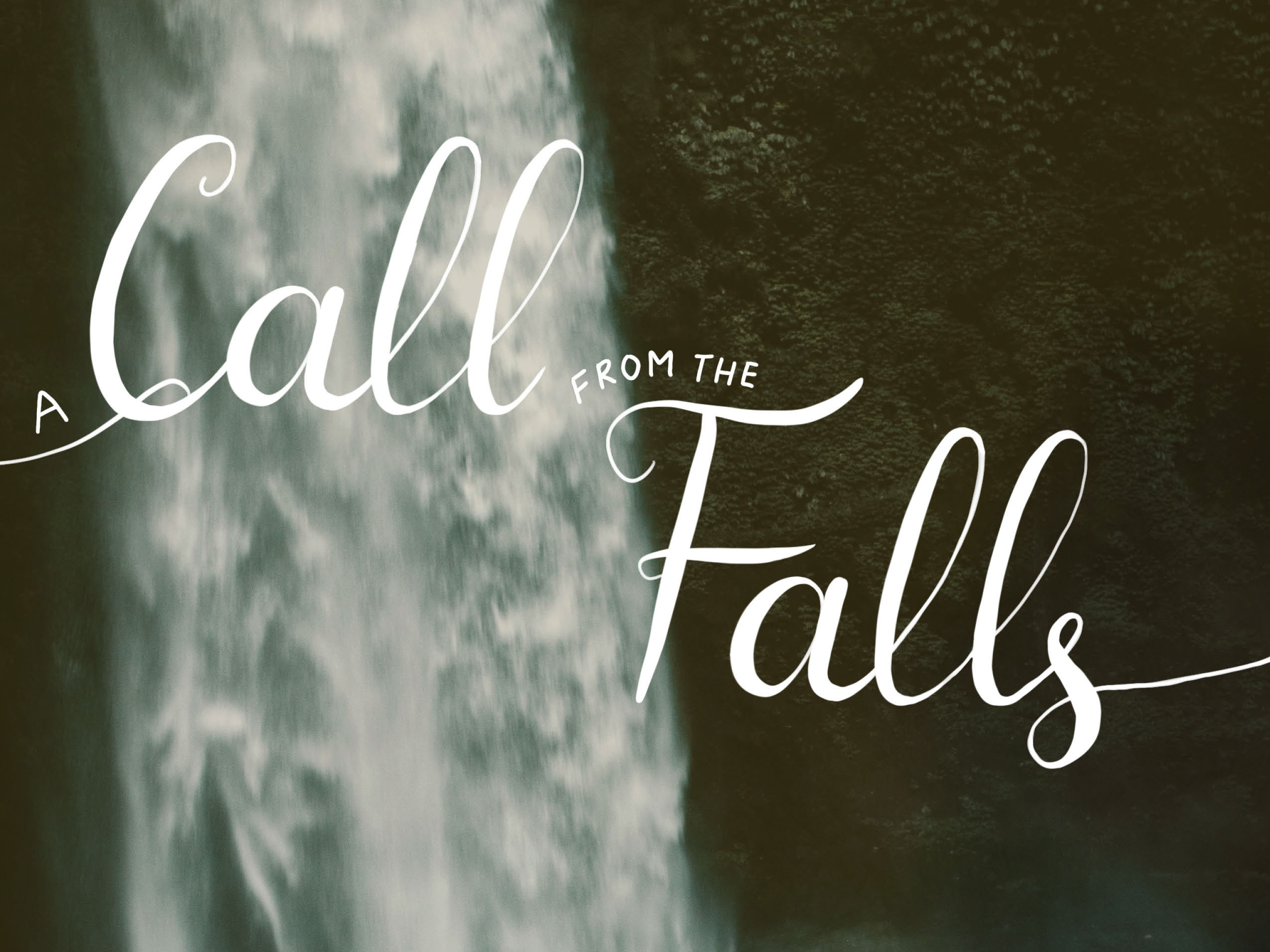
It was my first time using Adobe After Effects. As I had previous experience with Adobe Premier Pro, I learned After Effects's basics in one week. These are the animations I delivered after two weeks of getting accustomed to the software.
A summer break passed by, and I came back to the company with a fresh start for the Fall. As I mentioned above, Sophie never failed to throw challenges at me. (And I absolutely love that.) I was tasked with designing six wall posters that would lead visitors from the front hallways to the two wings of the building. Wait what? So, whoever enters the building will see these posters?
With that in mind, I overthought the assignment.

Internal Wall Poster 16 x 24 (1 of 6)

Internal Wall Poster 16 x 24 (2 of 6)

Internal Wall Poster 16 x 24 (3 of 6)
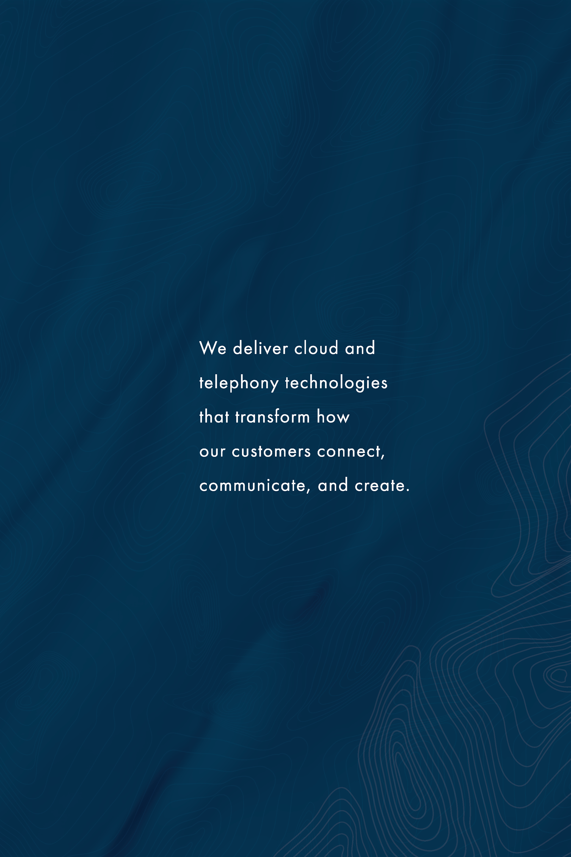
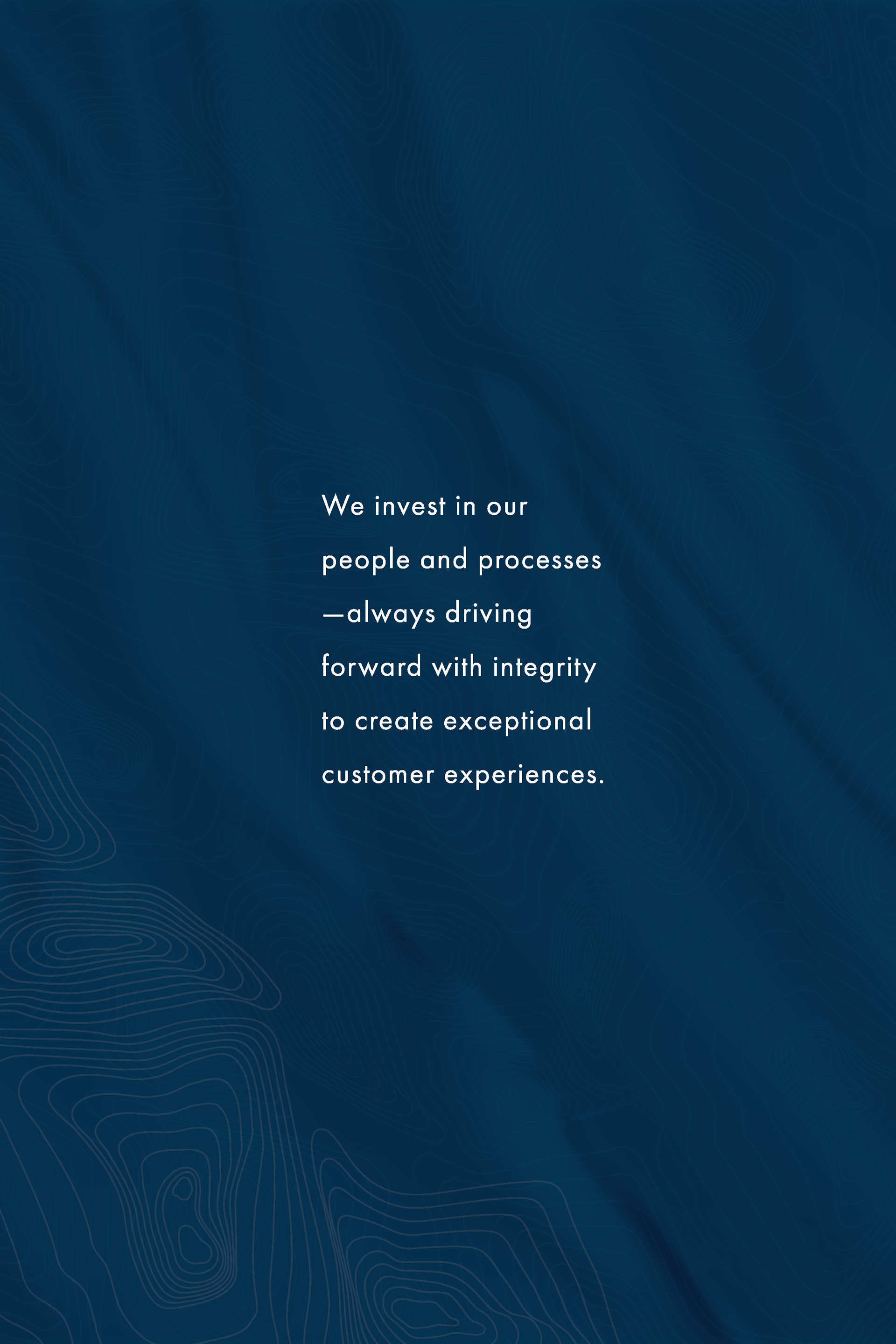
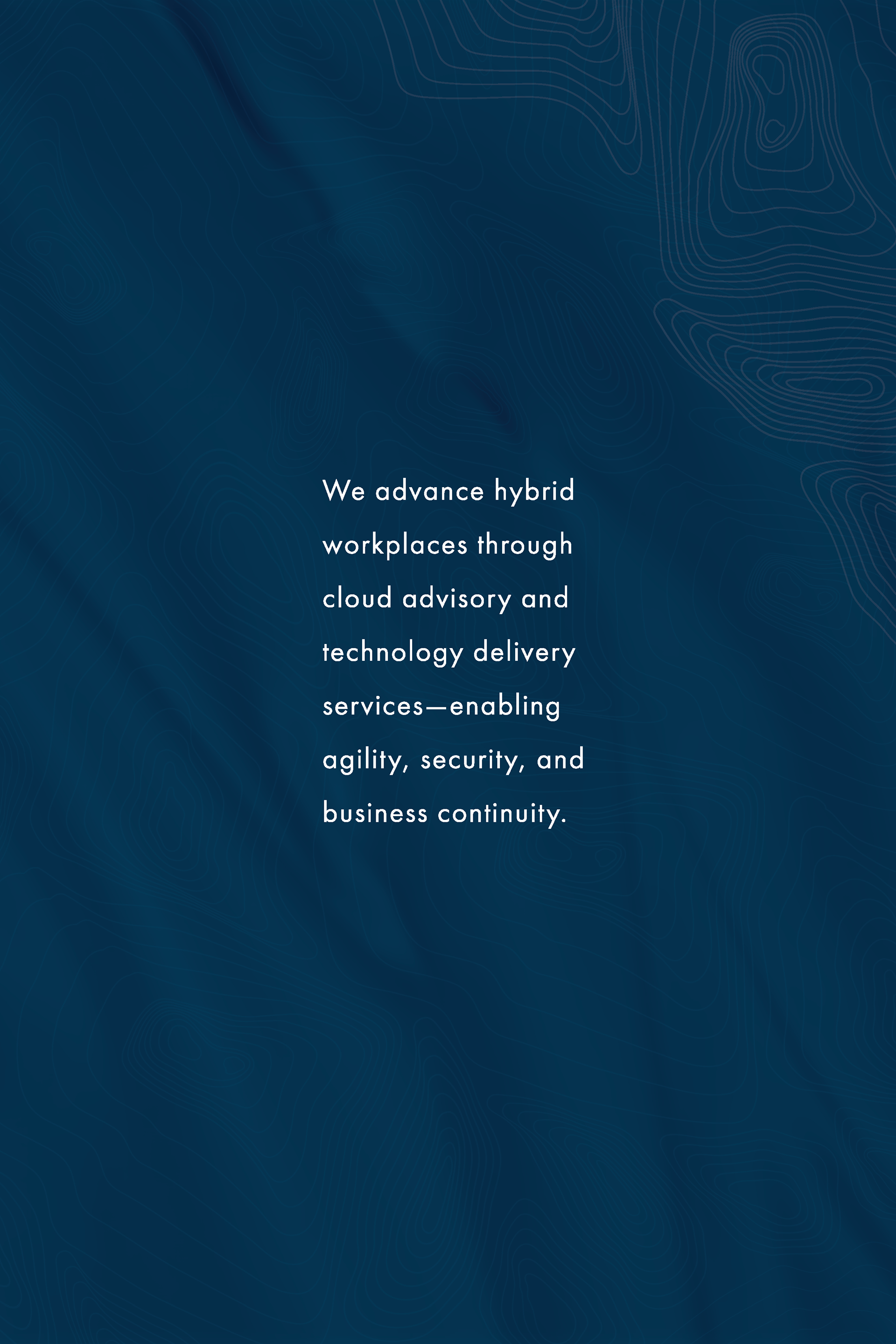
I created numerous drafts, ranging from complex to minimalist compositions. I have to admit that I didn't want these posters to look "easy." I wanted them to convey to the viewers that a lot of time and effort was put into making them, utilizing the most intricate, top-notch design skills.
But then I realized the most important thing was my process of going through a ton of drafts and arriving at a minimalist, concise, and effective solution.
Mockup of wall poster set (1 of 2)
I took a chance when I incorporated these bright yellow circles. As you can see above, the circle has been used in multiple documents, but using it as an embodiment of technology solutions in line with the subject is new to me and the department. And as I experimented with the subtle patterns and duotone gradient, with art direction assistance from Sophie and Whitney, we came to this final version of the wall posters.
A simplified means of communication, a transformation, an ideal technology solution.
Just like the company's tagline: IT made simple.
Mockup of wall poster set (2 of 2)
b. small projects
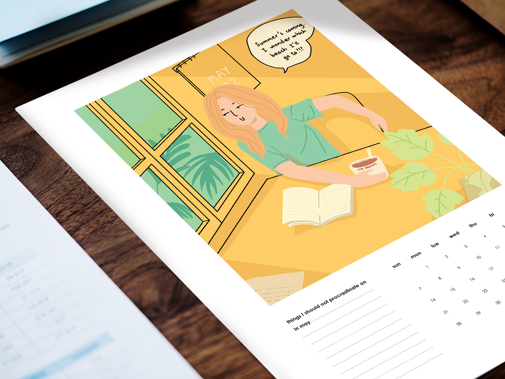
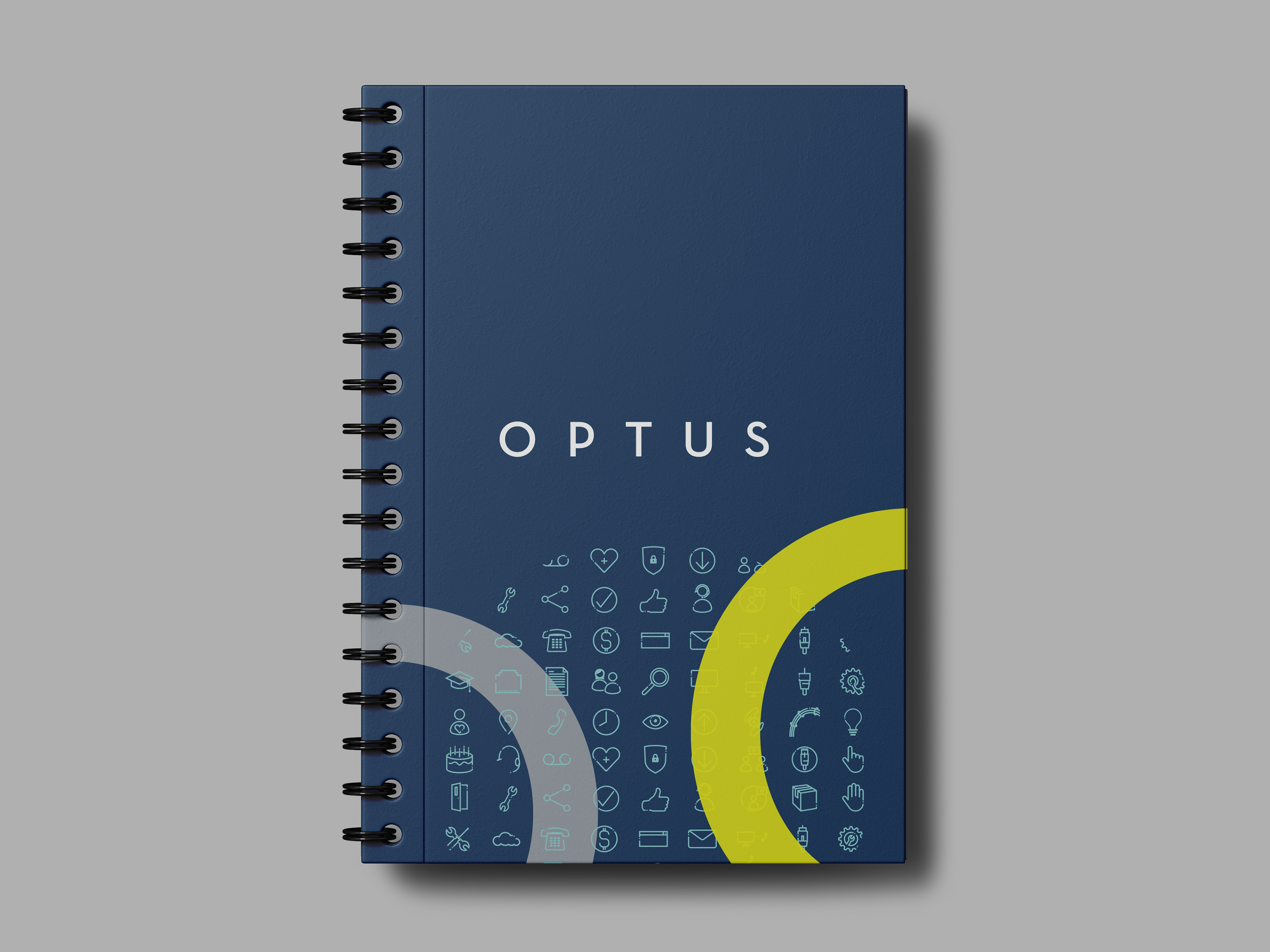
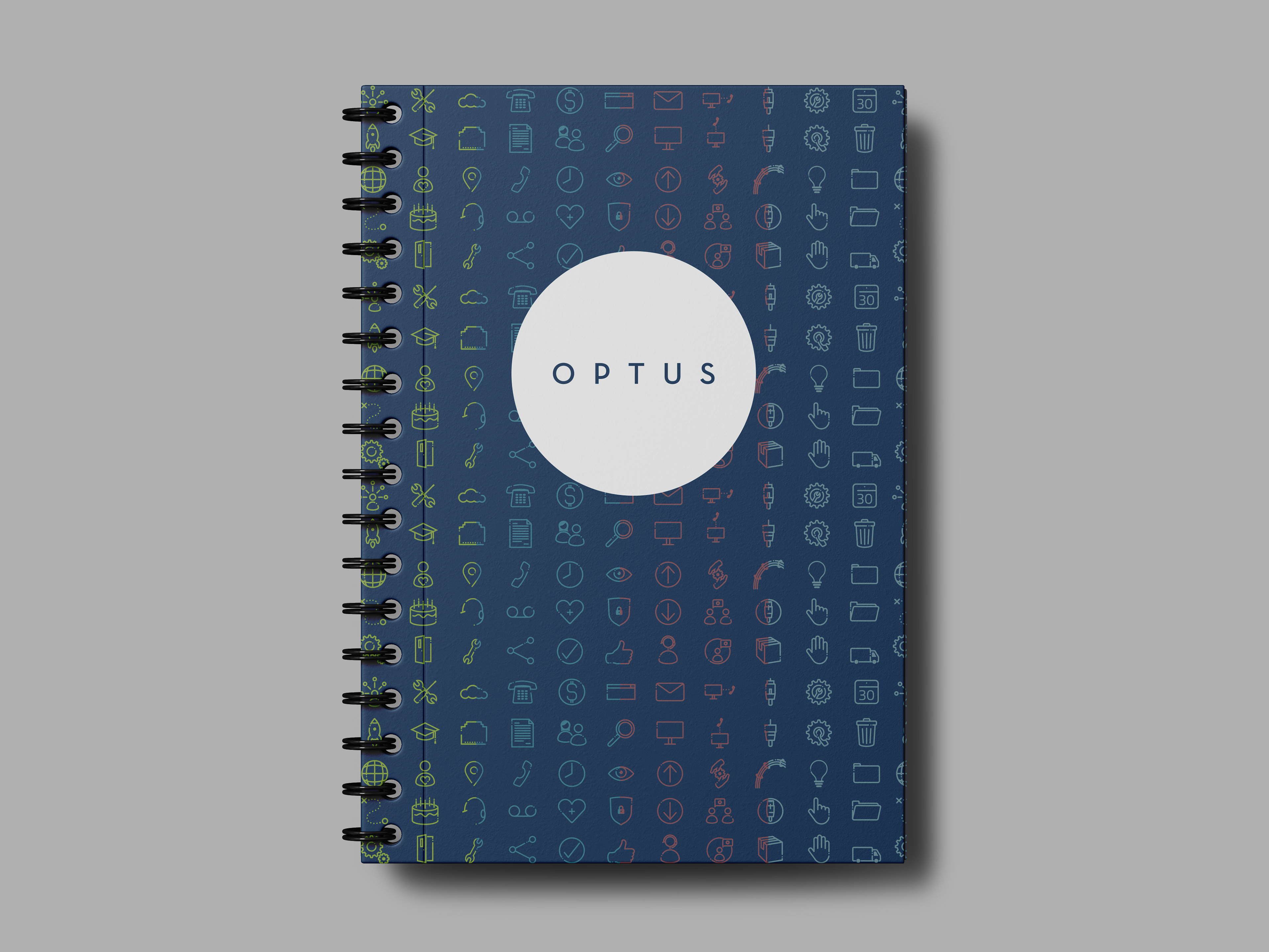
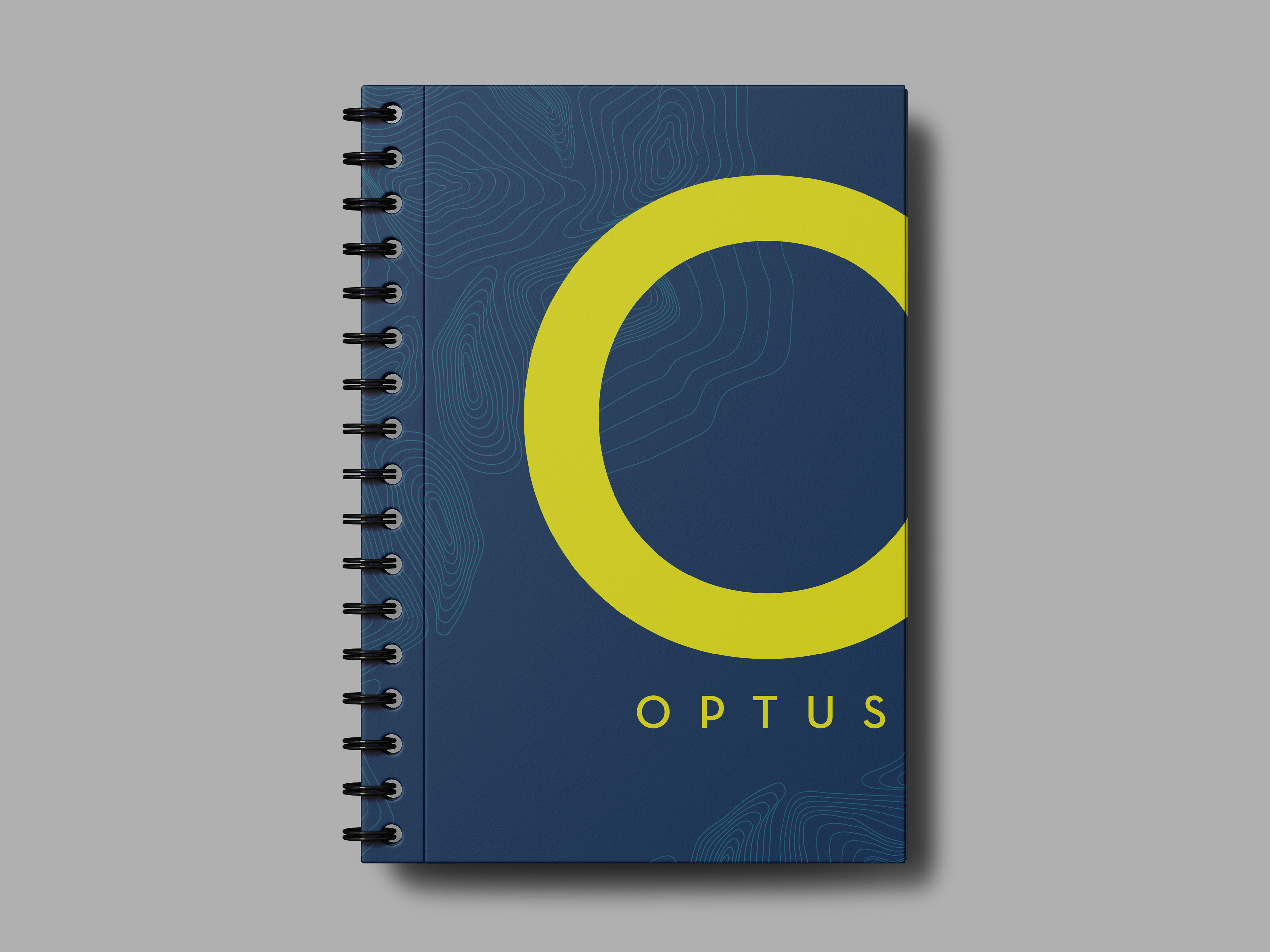
Having experimented with different visualizations while staying consistent with the brand guidelines, I finally took on some fun tasks of creating digital and internal assets. Below are some examples of the work I delivered (blog headers, presentation slides, internal posters and swag, etc.) throughout my internship.
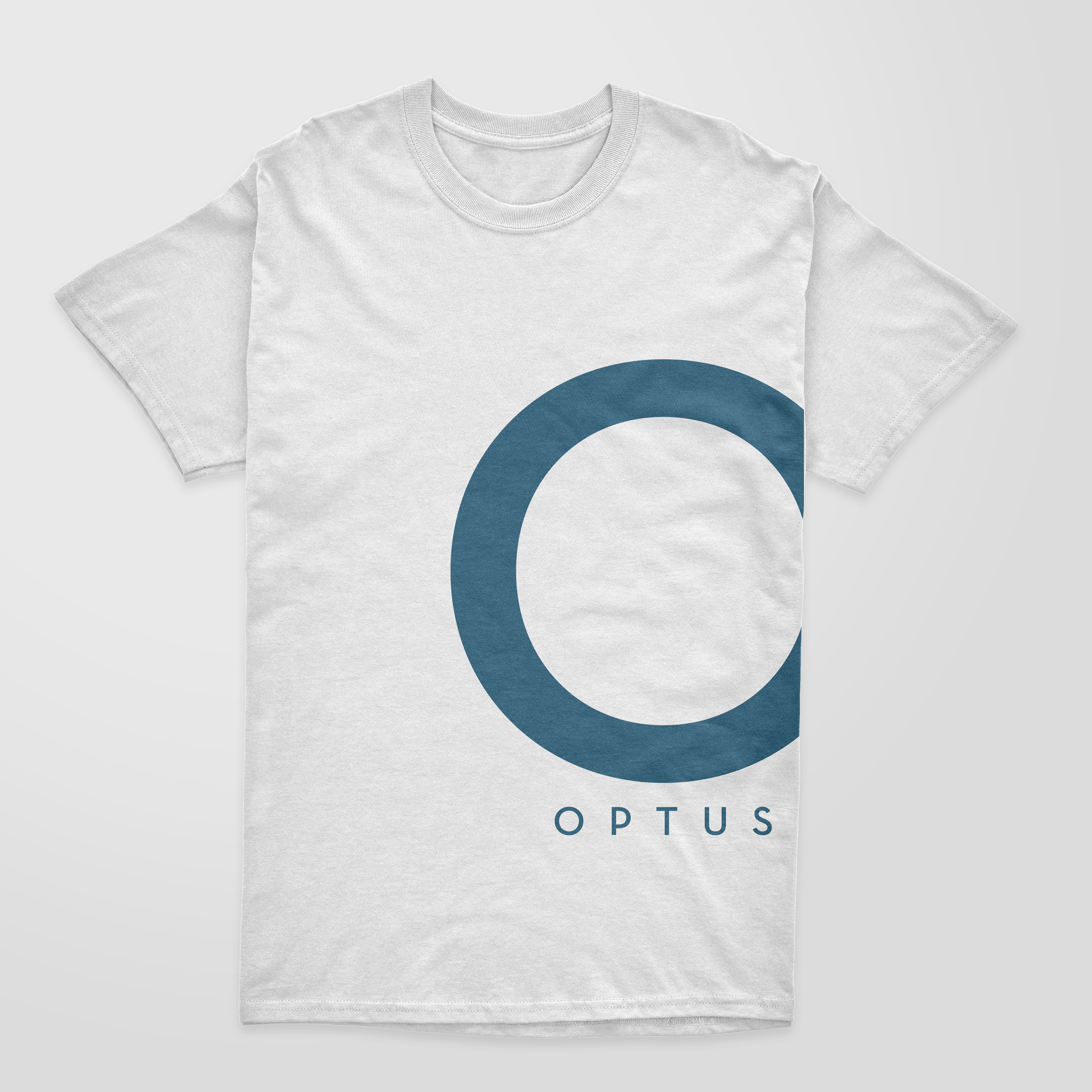
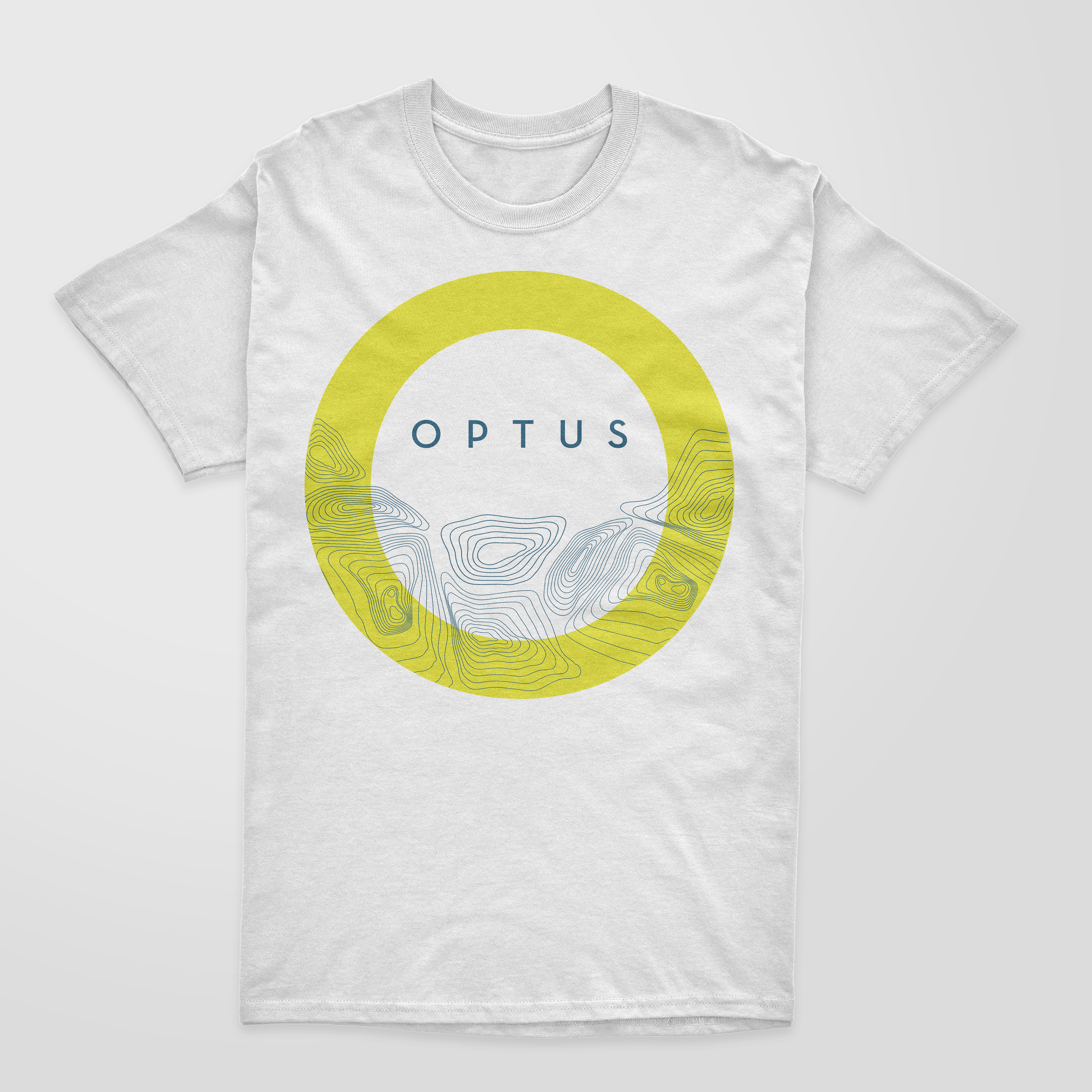
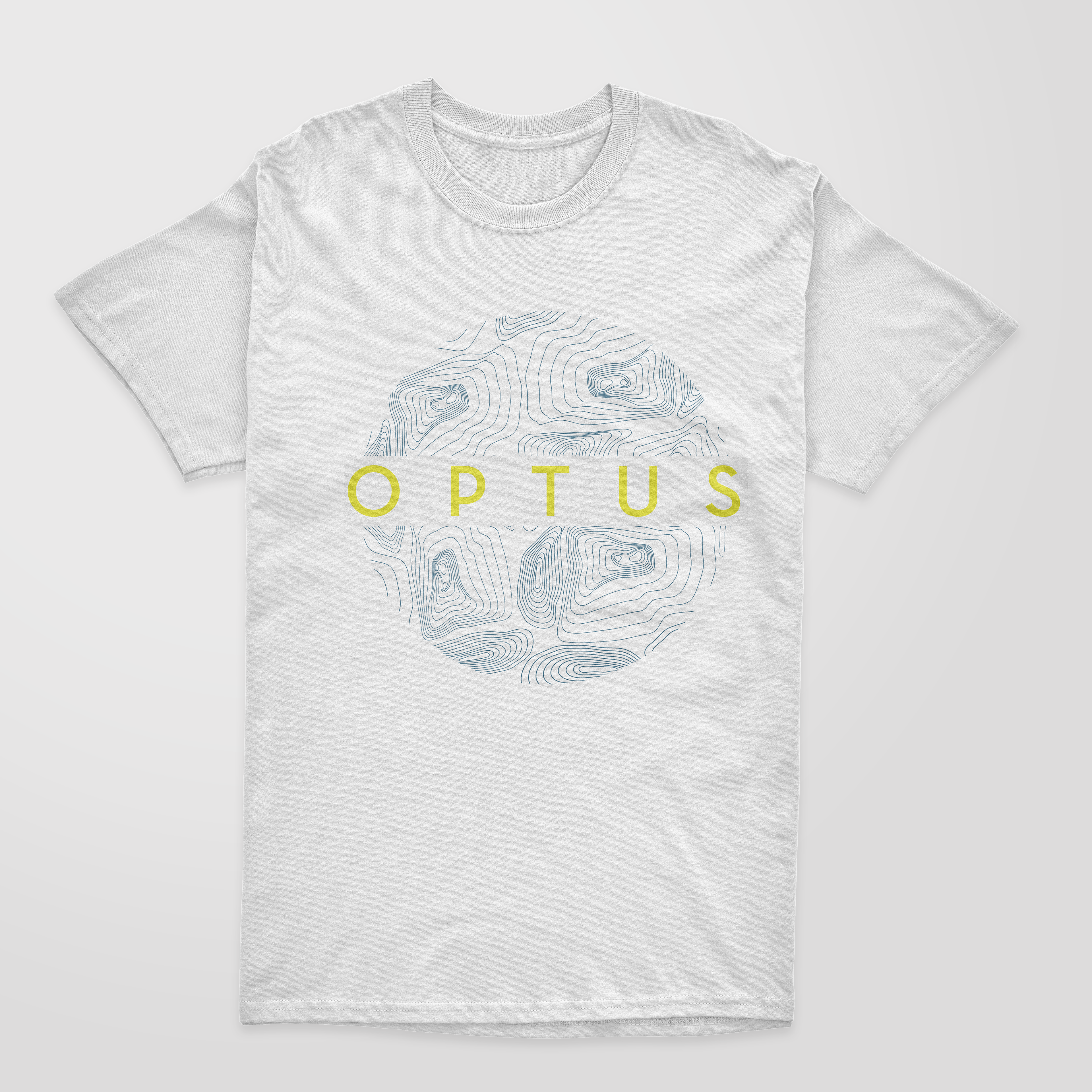
skills: adobe creative suite, illustration, animation, visual branding
